Showing posts with label colour. Show all posts

Saturday, 27 June 2015

Brick Lane By Night

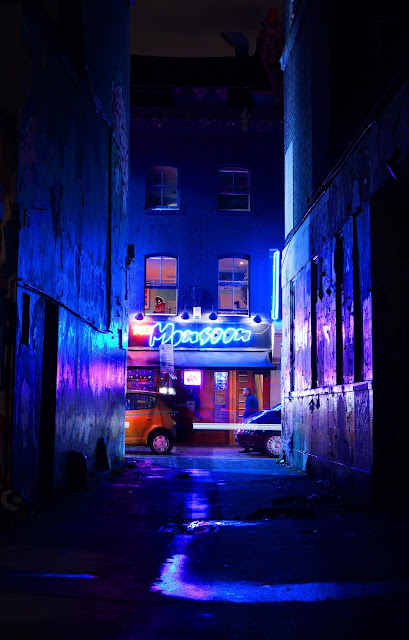
Last Saturday night I joined up with the people from London Photo Walk to go on an all night solstice walk. We covered about 23km over 11hrs or so. It was a long but extremely rewarding night and I look forward to doing it again next year.

graffiti, street art, east london, brick lane, urban, black and white, colour pop, long exposure, light trail


Given that this took place all through the night exposures were all very long, generally 15-30 seconds. It was also quite difficult to even know exactly what you were pointing your lens at as it was so dark in some of the back alleys and so composition wasn't always straightforward. This meant that over the 11hrs I only took about 100 photos; but there was a definite benefit to this. It was a bit like shooting with film, you were forced to put a lot more thought into what you were doing. If you pressed the shutter at the wrong time then you wasted half a minute of your life, which may not sound like much but it is quite the motivator when the wind is blowing at three in the morning.

graffiti, street art, east london, brick lane, urban, long exposure, fox, neon


As I said, we covered a lot of ground that night but the four photos in this post are all from the ever fascinating Brick Lane; one of my favourite streets in the world. Endlessly interesting and always full of life I have spent countless hours walking it's length, generally in the dead of night, but this was the first time I had ever taken my camera with me. I think it paid dividends. It isn't very difficult to make great art look good and obviously street art lends itself to street photography, something I normally struggle with.

 east london, brick lane, urban, blue, alley, ghost,

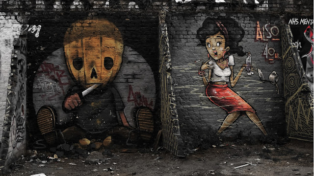
Except for the fox, each of the pictures here have undergone quite a lot of post processing to bring out the best in them, or, rather, conceal the worst in them. These pictures were quite busy and messy to start with and mostly what I have done is to crop them down and remove colours to hopefully simplify them and make them easier on the eye. The shot below is a great example of where the original exposure wasn't up to snuff. There was different coloured crap all over the floor, the edges of other artworks to either side and and some unattractive lintels over the top. I cropped out most of all that, made it black and white to remove the distracting colours and then just allowed the reds and yellows to come through to keep it simple. Hopefully the result is a more satisfying picture that allows you to focus on the graffiti. It's a cliche but less is often more.

graffiti, street art, east london, brick lane, urban, black and white, colour pop, long exposure

Sunday, 17 August 2014

Lest We Forget....

Pretty much everyone in London must be aware of the various commemorative public art installations that have been happening over the past few weeks to mark the centenary of the First World War beginning. With the passing of Harry Patch in 2009 this conflict did truly become history; he was the last surviving soldier to have fought in the trenches of western Europe. It is now only through books, documentaries, films and other second hand sources that we can learn about what is sometimes called The Great War.

Tower of London, poppies, poppy, red

I'm not sure a war should ever be called great. Whilst there are certainly circumstances where it is worthwhile to take up arms to defend an ideal or way of life I don't think that we should necessarily glory in it. War should be a last resort, a terrible necessity carried out only to the extent necessary and only when no other option remains. Was the First World War one of these occasions? I honestly don't know. I've read conflicting views on this and am not qualified to make a judgement. I'm not sure that anyone is. I am sure that we must make sure nothing like that ever happens again and that is why installations like this are welcome. Each ceramic poppy in the pictures here, and I have by no means covered them all, represents a fallen soldier. I don't know how many there are, many hundreds of thousands. Too many.

Tower of London, poppies, poppy, red

Tower of London, poppies, poppy, red
The same as the first picture but original colour


Sunday, 16 March 2014

The Lomo Effect

Well it's been a few weeks so I thought I'd better come up with something for the blog and, so, I've investigated the Lomo style of photography and come up with a little guide on how to take a bog standard snap and give it a bit of the old Lomo magic. 

For those of you that haven't heard of it I should probably describe what the Lomo style, or Lomography, actually is. I guess it's actually two things; one of which is easy to define, the other of which isn't. The easy one is the physical look of the photos; there tends to be a vignette (darkening at the corners), the colours are very rich (due to the use of slide film and the common practice of cross processing the negatives) and the quality is generally low with blurriness, poor exposure and even light leaks frequently featuring. Most of these properties, normally avoided at all costs by most photographers but sought out by the lomographer, are down to the very low build quality of the lomo camera. Think 1980s, Russia, plastic.

The element that is more difficult to pin down is the style and composition. Perhaps a good place to start would be with the motto of the movement: Don't Think, Just Shoot. Although it could easily be confused with the motto of the American military it is actually a style encompassed by The Ten Golden Rules of Lomography as laid out on their website. These include such adages as Take Your Camera With You Everywhere You Go, and, Lomography Is Not An Interference In Your Life But A Part Of It. Basically, they try to encourage you to break every traditional rule of photography that ever existed. The Rule of Thirds would be anathema to a lomographer. I highly recommend a look at their site to get more of a feel for this unusual brand of photography; you'll probably either like it or you wont.

The question is: how did such an odd, counter-intuitive and niche movement even get started, nevermind become an international phenomenon? It all started as recently as 1992 when a group of Viennese art students came across an old Lomo camera whilst on a tour in Prague. They found it in an old camera shop and used it in a very casual kind of way, often not aiming, shooting from the hip and generally just mucking about. Upon returning home and developing the film they were charmed by the "unique, colourful and sometimes blurry images" that were produced. Interest amongst friends and family rapidly grew and the following year they founded a society in honour of the strange new camera. The camera in question was a Lomo LC-A Compact Automat, produced some ten years previous in the USSR. The build quality of the device was.... well, there was no build quality; but this leant itself perfectly to the students shooting style.

There was a problem, however; with the fall if the USSR also came the end of the production of the camera and the prospect of a ready supply of the student's new favourite toy. Undaunted, the students flew to St. Petersburg, where the Lomo factory was located, to make a deal for tax breaks so as to make it economically viable to continue production. They successfully got the special permission required from the mayor of the city, a very amiable and friendly chap, one V. Putin. The rest, as they say, is Lomography. Production has since shifted to China and production continues to this day; the future of Lomography seems secure and Lomo cameras remain cheap and affordable for all to try. The film is now the increasingly expensive part.

But what if you don't want to faff about with film and developing and such like and just want to create the same effect using your existing DSLR and a bit of canny processing? Well, I'll show you how - so long as you intend to use Adobe Elements, although many applications are broadly similar these days. Those of you not interested in the technical parts can just skip to the pretty picture at the bottom.

photo, style, lomo, lomography, lomograph, railway, train track, trees, sky, grass

The picture we're going to start with is no great shakes. The exposure isn't great, I should have got my neutral density filters out, the sky is overexposed and there's some lens flare; but as we're aiming for the Lomo style none of this should matter, if anything it'll help. So there are two main things we need to do here; create a vignette and achieve a cross-processing effect by increasing saturation and contrast. There is more than one way to do each of these steps including just clicking through the guided Lomo Camera Effect wizard, but where would the fun be in that?

There are two easy ways to create a vignette. The first is to simply go to Filter>Correct Camera Distortion and use the sliders in the vignette tool, which are normally used to remove a vignette, not to create one. I'd normally go for somewhere around -40 to -50 but it's totally up to you.


The second way is a little more involved but gives you more control. Take the Lasso tool and, having selected a feathering level of, shall we say, between 100-200 pixels, draw a vaguely circular shape in the middle of the photo. Again, we're not aiming for perfection here. We want to alter the outside of this circle not the inside and so you need to click Select>Inverse. Now create a Levels layer and slide both the shadows and the midpoint markers to the right a little, this will add to the vignette effect. I actually prefer to use a combination of these two methods to make my vignettes.


That's the vignette sorted but now we need to work on the distinctive colour palette of lomography; again, there are a couple of ways to go about this and I like to use a combination of each. First up: colour curves. Click on Enhance>Adjust Colour>Adjust Colour Curves... (yes, it really does have the three little dots after it). Here you are presented with a straight diagonal line on a grid. The left hand side of the grid represents dark colours, the left hand side highlights, and the middle is the midtones. There are several preset options available but you can also drag the points on the line to warp it. Moving any given point on the line either up or down will make the corresponding band of colour more or less intense. We want to make the curve look like an S; this will have the effect of making the highlights brighter and the dark parts darker, i.e. increasing contrast. If your line looks something like the one in my example below then you're on the right track. Press okay when you're happy with the effect achieved.


I would also recommend increasing the saturation, this will help to achieve the cross processing effect that is so synonymous with the Lomo style. To do this you can either click on Layer>New Adjustment Layer>Hue/Saturation... or simply click on the button with the diagonally divided circle on it on the right hand side and select Hue/Saturation... Use the slider for Saturation to give your colours a bit of a boost. For a 'normal' photo I wouldn't want to push this much past the mid teens, but for the Lomo style you can probably get away with numbers in the 30s, 40s or even higher depending on the photo.


In the same way that you got your Hue/Saturation... layer you can now select a new Brightness/Contrast... layer. Here, I wouldn't say that the Brightness has to go one way or the other, this really depends on what look you want to achieve with any given individual photo, but I would recommend increasing the contrast a little.


Lastly, I would say it's worth while putting a Fill layer in. To do this, select Layer>New Fill Layer>Solid Colour... Call the new layer whatever you like or leave it as the default and click Ok. This should default to a layer of pure black and you will completely lose the picture you have so carefully created. Fortunately it is only hiding behind the black layer and we now have to blend the two together to reveal the finished product. Click Ok again. At the top right in the Layers panel you will have a drop down box with various different blending options; I would recommend Soft Light or Hue or Saturation and an Opacity of something like 30-50%. This should really help bring about that cross processing look. Cross processing, by the way, is where you develop film using non-standard chemicals. There are two main film types; standard 35mm and Colour Slide film. Each of these sets has their own chemicals used in their development, C41 for 35mm and E6 for Colour Slide film; however, lomographers noticed that you can get some really cool results if you swap these up. As I understand it the more common option is to use Colour Slide film and process it with 35mm chemicals.


That's about it. With any luck you should now have a photo worthy of the annals of Lomography, or at least something that looks a little old timey; you can see my effort below. None of the techniques I have mentioned here are set in stone; indeed, that would go against the whole freestyle notion that made Lomo popular in the first place. The idea is not to be constricted by the traditional norms, to break the rules and not to worry about the consequences. As Rule #10 of Lomography says: Don't worry about any rules.

photo, style, lomo, lomography, lomograph, railway, train track, trees, sky, grass

Tuesday, 15 October 2013

365 Project: Photo 288

A pleasant sunset stroll along Hampstead Heath, my first visit there in a very long time. Taken on my phone and cropped, hence the graininess.


Saturday, 12 October 2013

365 Project: Photo 285

It's been a while since I pretended my photo is on topic so here goes....

The theme today is Close and, indeed, this is quite a close up picture of a rapidly rotting rose. What I was actually interested in, however, when I put this together was the idea of a triptych. I've had a few ideas for triptychs and over mosaic type images for a long time now but I didn't actually have the expertise required to pull them off - and so I thought I had better educate myself. The web is positively bubbling over with video tutorials that make this sort of thing fairly foolproof and it proved to be none too difficult. Having said that, whenever I use the word foolproof I'm reminded of the witticism: show me a foolproof plan and I'll show you a bigger fool. Still, this wasn't too bad for a first attempt.


Friday, 2 August 2013

365 Project: Photo 214

A piece of graffiti I spotted on a walk in north London. I thought I would use a bunch of imagination in the processing of it. I've gone fairly overboard but deliberately so.


Friday, 3 May 2013

Sunday, 16 December 2012

What Does Monday Taste Like To You?


I've been getting a lot of feedback over the past few days on last week's foray into the world of science. I've been relieved to find that it has been overwhelmingly positive on the whole and it's certainly brought a lot of new traffic to the blog. But nothing is ever perfect and I have also received some constructive criticism, which is always welcome. One such criticism was that I need to be careful of my tone, I mustn't give the impression, for example, that I think people who disagree with me on certain topics are idiots.


To be clear, I absolutely do not think that. There are any number of reasons why some people hold different views to other people and that they are idiots is only one of them. Don't get me wrong, there are plenty of idiots out there but there are also lots of people who just haven't given any great consideration to many topics, or haven't had the benefits of a mainstream education, sometimes there are topics where the evidence doesn't clearly point in one direction or another and we just have to wait for more data to come in before we can be certain (this does not include ghosts or astrology), and there are also people who have grown up in a culture where they have been encouraged to think things which are not necessarily, shall we say, accurate? But when I write this I have a certain audience in mind. I'm not looking to convert true believers into atheists, I don't want to have to explain to someone why the apparent position of balls of plasma light-years away doesn't have an effect on the personality of humans on our rocky planet; I'm speaking to people that believe the Earth is billions of years old not thousands, that all life evolved from one common ancestor and that bacon sandwiches are awesome. My writing about photography has always been aimed at people who are interested in an honest portrayal of the natural world we inhabit and the societies we have created within that, I don't see my science writing as being any different to that.

One thing I will say is this; never take my word for anything I write here. Have a think about it, question it,  do your own research into the topic, ask yourself if it sounds likely and what mechanism might be behind it. I am more than capable of making mistakes, mistyping, or getting completely the wrong end of the stick. I would encourage you to take this approach whenever anyone tells you anything; always try to think critically, you'll learn a lot about the subject at hand but also about yourself and the people you interact with.

Having established as much, though, there is still a lot of scope for frustration and disagreement. My natural inclination is to focus on the detail of any given topic whereas other people might like to speak in broader, more general terms. Those people find my way of arguing to be overly narrow and pedantic whilst I find theirs loose and woolly to the point of being meaningless. But imagine you had another way of seeing the world altogether. What if you could smell colours or hear printed words? What if you could taste the days of the week and see numbers that people spoke to you? Such people do exist. They are called synaesthetes (SIN-iss-teets) and are affected by the condition synaesthesia. Literally this means 'joining of the senses' and it's actually a pretty good description of the condition. Some people will taste words; others hear colours; others will see spatial representations of sequences, for example, they'll see the numbers 1-10 running left to right in front of them, 11-20 will run upwards, 21-30 will be over their left shoulder and so on. Over 60 different manifestations have been reported.

When Franz Liszt first began as Kapellmeister in 1842, it astonished the orchestra that he said: 'O please, gentlemen, a little bluer, if you please! This tone type requires it!' Or: 'That is a deep violet, please, depend on it! Not so rose!' First the orchestra believed Liszt just joked; more later they got accustomed to the fact that the great musician seemed to see colours there, where there were only tones. One of my favourite physicists, Richard Feynman, is quoted as saying, 'When I see equations, I see the letters in colours – I don't know why. As I'm talking, I see vague pictures of Bessel functions from Jahnke and Emde's book, with light-tan j's, slightly violet-bluish n's, and dark brown x's flying around. And I wonder what the hell it must look like to the students.'

Whilst not all synaesthetes become legendary composers or Nobel Prize winners there certainly isn't any great cause for concern. Whilst seeing sounds and hearing colours can be distracting to young children initially it seems that the vast majority of those affected grow to use it to their advantage and consider it a blessing; if they've even realised that not everyone senses the world in the same way that they do, that is. Depending on the form the synaesthesia takes it can help with mathematics, time management, better memory recall and other such tasks. I'll try to explain how shortly.

It looks clear now that there is a tendency for synaesthesia to run in families but no specific gene has thus far been found. Also, it doesn't tend to be passed on from father to son and so there has been speculation that whatever genetic components are involved may be on  the X chromosome; however, 2 cases of father-son transmission have now been documented. To me this suggests that it is likely to be a polygenic disorder i.e. caused by more than one gene. Whilst this means there are more targets to be found the reality is that polygenic disorders are notoriously difficult to pin down; examples of well characterised polygenic disorders are rarer than unicorn tears. It should be noted that the form it takes isn't passed on, a mother who tastes colours might have a son who smells words - not a sentence I ever thought I would write.

How exactly this phenomenon comes about is not precisely known at present. For a long time it was thought that it was a simple matter of 'leakyness'; e.g. visual signals stimulating the auditory cortex. The electrical signals caused by stimuli that would normally be interpreted in one part of the brain were just spilling over into adjacent areas; but this doesn't really hold together as parts of the brain that become mingled aren't necessarily next to each other. It appears as though there are structural differences in the brains of synaesthetes; there is good evidence that they have more grey matter than the average and that there are more physical connections than the average between their neurons, not just between the sensory areas but generally throughout the brain. There is also increasing amounts of evidence that higher level brain function can be brought to bear on the phenomenon. New associations can be learnt and applied to previously unknown situations; for example, people with grapheme-colour synaesthesia (the most common form) can be shown an alphabet they have never encountered before, like the glagolitic, and learn a completely new set of links between colours and the symbols. This process can be both organic and directed and can happen in less than ten minutes. This would suggest that several separate systems are all involved in synaesthesia and is another excellent example of the plasticity of the human brain.


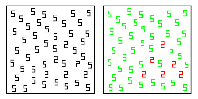
I mentioned earlier that being a synaesthete can have it's advantages, let's look at a few examples. Look at the picture below, try to look at the picture on the left first. Not very interesting is it? Just a whole bunch of 5s randomly strewn about. The picture on the left is a little more interesting, it is identical except that colour has been added. All of a sudden it is very apparent that it isn't just a mass of 5s on the page, there are also a few 2s thrown in. You would have eventually spotted that in the original picture if you'd had a good look at it, but it required only a fraction of a second in the next image (admittedly, as red and green were used, colour blind people will have struggled with this one). People with grapheme-colour synaesthesia pick up on the 2s far faster than the rest of us do.

So what practical applications are there for this? Look at this next picture below of some simple sums. We can all do these, they're at a pre-school level, but children tend to grasp colours before they do numbers and those children who also have grapheme-colour synaethesia will have an extra level of association to latch onto that will likely propel them to the head of maths class. If they learn to harness this to it's full potential then maybe that's one way how we get people like Richard Feynman. You may also imagine how Liszt saw the colours of the notes of his composition rising from the orchestra; if you also had an idea of the colours you wanted to invoke as you composed then this could potentially be an extra tool with which to fine tune the piece as compared to those of us who have to just listen very carefully.


The first reference I can find to synaesthesia was in 1880 by the legendary Francis Galton, so we have known about this for quite a while and as awareness of the condition grows it is now thought that as many as 4% of people could be affected, which sounds like a lot, but many don't even realise they are unusual. The question boils down to this: Is this an entirely new type of phenomenon in the brain or merely an extreme form of something very typical? This is a question that crops up time and time again in neurology and hopefully in many cases we will be able to resolve it as we slowly get a handle on what baseline brain activity really is, if there turns out to be such a thing. One final example, look at the picture below. One of these shapes is called Booba (stop giggling) and the other is called Kiki. Decide for yourself which is which. I know which way I went and I can be fairly confident of which way you will go; the jagged shape on the left will be Kiki and the more rounded one on the right will be Booba (stop it). That's how 98% of people assign them.


So is this a very low form of synaesthesia that we all share? Is it a phenomenon that is unrelated but gives a similar sort of outcome? Is it more of a cultural effect to do with the shapes our mouths and lips take as we pronounce the words Kiki and Booba (see me after class) and the way we associate them with the symbols in the picture? The answer is: we simply don't know. But I do know how we'll find out; through careful observation, rigorous application of critical thinking and leaving your preconceived ideas at the door: through science.


For more information on synaesthesia I have provided links to some of the sources I used. Google will also lead you to some of the support groups that exist like the UK Synaesthesia Association.

All images used with permission under the Creative Commons License


http://www.journalofvision.org/content/9/12/25
http://www.ncbi.nlm.nih.gov/pubmed/18550184?itool=EntrezSystem2.PEntrez.Pubmed.Pubmed_ResultsPanel.Pubmed_RVDocSum&ordinalpos=2
http://www.ncbi.nlm.nih.gov/pubmed/19028762
http://en.wikipedia.org/wiki/Glagolitic_alphabet
http://www.newscientist.com/article/mg20427393.800-is-synaesthesia-a-highlevel-brain-power.html